,,Opposites attract.’’

Color moods and materials in interior design in 2020.
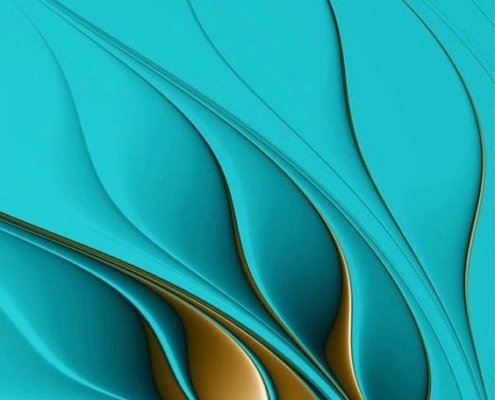
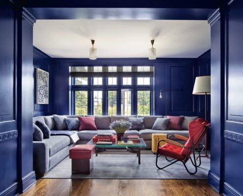
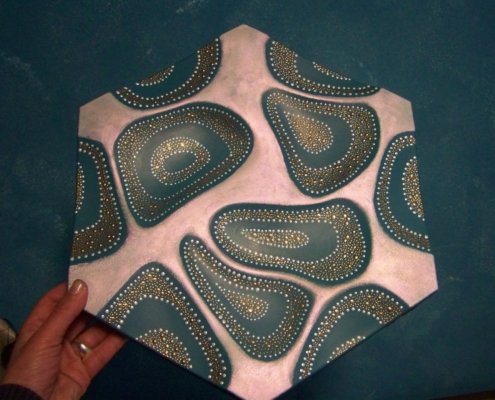
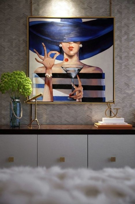
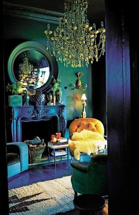
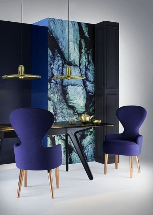
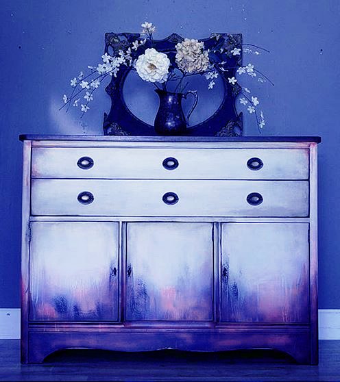
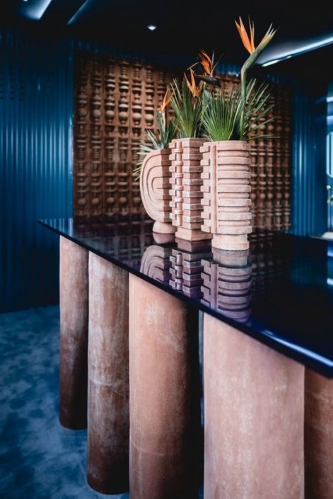
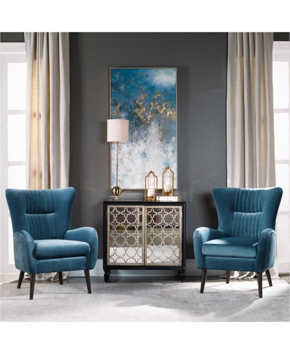
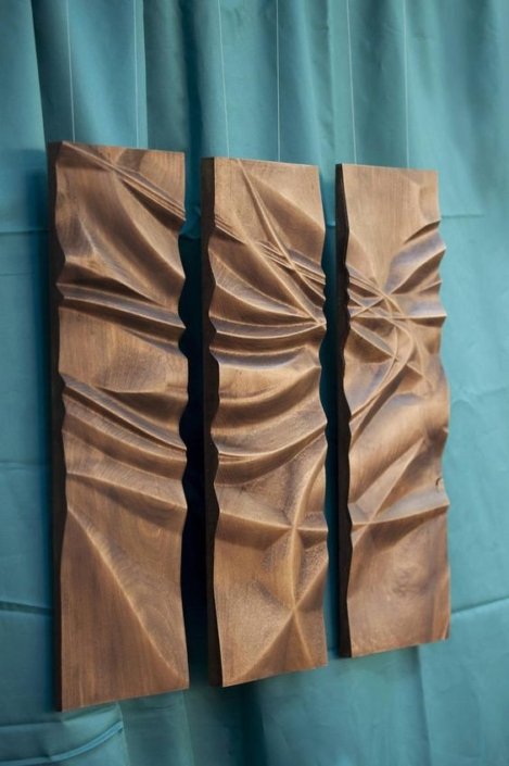
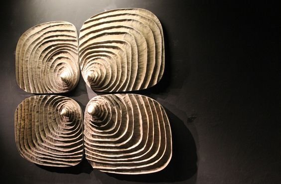
One of the interior design trends this year is: “Opposites attract.” Natural materials combined with better technology and product recycling. The vision is in that direction. Natural colors from nature, combined in harmony with opposites – in gold, silver, bronze, black and copper shades. We give way for more artistry and adventure in the interiors.
Of course, imagination is a must for interior designers to offer this eclectic cocktail in your interior combined with comfort. Accessories and décor are the focus of the furnishings as they model a sense of uniqueness. This allows no general alterations to the home to be made to give a different sense of design.
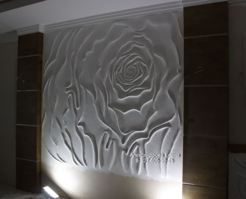
There are many interesting options for combinations between these options. There are many interesting possibilities for combinations between these elements. Shades of blue, green, graphite, and the timeless whites and cappuccinos are emphasized with vibrant, intense moods like theatrical yellow, ruby, provocative orange, coral, dramatic purple, ultramarine, sapphire, or topaz… Wood, stone, metal, clay, glass, and unconventional accessories are transformed into a new, more liberated vision. Recycling atypical materials from different work areas, combined with innovative interior designs such as panels and materials, is the ideal solution for any creative interior designer if they want to create something different.
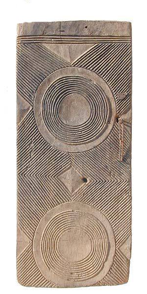
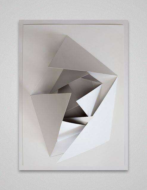
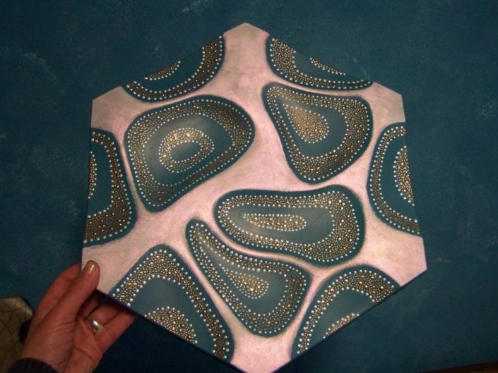
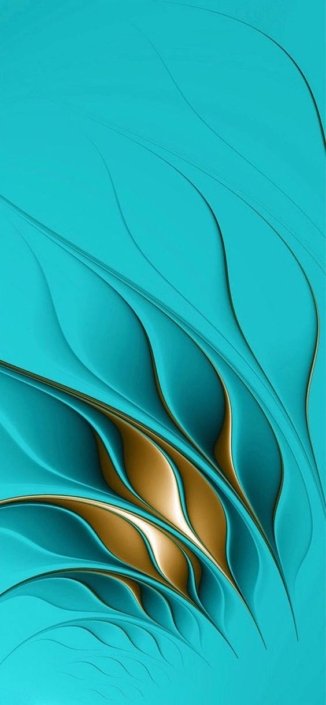
Pictures: Pinterest

